Styleguide

Breakpoints

Colors

Primary color
#EC5F71
Blue
#44BDD2
green
#C7CF00
Orange
#F6A000
Violet
#5D637E

Icons

administrative
aide-a-domicile
aide-menagere
assistance
assistante-de-vie
at
auxiliaire-de-vie
blog
building
calendar-checked
call
carpenter-ruler
cart
checkmark
circle
clock
cog
cup
dame-de-compagnie
dish
down
Created by Icon Fairfrom the Noun Project
drag
emergency-call
encounter
external-link
facebook-f
facebook
file
france
garde-de-nuit
hear
home-sensor
home
home2
house-hands
instagram
letter-i
linkedin
lock
mailman
man-child
menu
moon
motion-sensor
mountain-climber
next
old-mobile-phone
partners
personne
phone
piggy-bank
pin
previous
remove
respect
rubber-ring
satisfaction
shower
signal-bars
sleep
smartphone
sms
speech-bubbles
star--empty
star--full
star--half
suitcase
sweeper
tools
twitter
two-people
va
visual
vitalliance-logo
youtube
1
<%= icon('<name>') %>

Images

Bare

1
<img>

With caption

Caption
1
2
3
4
<figure>
  <img>
  <figcaption></figcaption>
</figure>

Typography

Fonts

System fonts for fast loading

Vestibulum posuere ornare mollis. Nullam varius porta fringilla. Mauris consectetur tempor mi, a porttitor est rutrum sit amet. Morbi pulvinar ligula quis felis sollicitudin vehicula. Vivamus feugiat a neque et imperdiet.

Lorem ipsum dolor sit amet, consectetur adipiscing elit

Nullam vitae erat mollis, ultricies lectus in, sodales dui. Donec efficitur malesuada ante eget varius. Nam congue facilisis erat ut fringilla. Nullam at semper sapien. Morbi nec mollis lacus.

Maecenas ut enim ultricies, euismod lacus a, lacinia nunc

Sed tristique elit nulla, eget sagittis velit posuere at. Nullam venenatis quam eu arcu hendrerit, vel rutrum sapien interdum.

Quisque elementum odio et commodo tristique

Maecenas interdum libero quis arcu mattis, sit amet faucibus metus consectetur. Donec scelerisque consectetur tortor, quis cursus justo imperdiet sed. Nulla quis hendrerit nunc. Aliquam at neque vel metus viverra fermentum.

Headers

Level 1

Level 2

Level 3

Level 4

Level 5
Level 6
1
2
3
4
5
6
<h1>Level 1</h1>
<h2>Level 2</h2>
<h3>Level 3</h3>
<h4>Level 4</h4>
<h5>Level 5</h5>
<h6>Level 6</h6>

Variants

Shouting in the dark

1
<h2 class="uppercase">Shouting in the dark</h2>

Links

Link
Bare link

1
2
<a>Link</a>
<a class="no-underline">Bare link</a>

Blockquotes

Lorem ipsum dolor sit amet, consectetur adipiscing elit. In at fermentum magna, ut lobortis leo. Morbi viverra faucibus interdum. Etiam at dapibus ipsum. Donec efficitur dolor malesuada nunc luctus pulvinar. Author name
1
2
3
4
<blockquote>
  Content
  <cite>Author</cite>
</blockquote>
1
2
3
4
5
6
7
<%= render partial: 'application/breadcrumbs', locals: {
  breadcrumbs: [
    { url: root_path, label: "Home" },
    ...
    { label: "Current page" },
  ]
} %>
1
2
3
4
5
6
7
8
9
10
11
12
13
14
15
<ol class="breadcrumbs">
  <li class="inline-block text-sm text-grey-dark breadcrumb">
    <a class="no-underline">
      <span>Home</span>
    </a>
  </li>
  <li class="inline-block text-sm text-grey-dark breadcrumb">
    <a class="no-underline">
      <span>Category name</span>
    </a>
  </li>
  <li class="inline-block text-sm text-grey-dark breadcrumb">
    <span>Current page</span>
  </li>
</ol>

Buttons

Default

1
2
3
4
5
<button class="button button-primary">Primary</button>
<button class="button button-blue">Blue</button>
<button class="button button-orange">Orange</button>
<button class="button button-purple">Purple</button>
<button class="button button-green">Green</button>
1
2
3
4
5
<button class="button button-sm button-primary">Primary Small</button>
<button class="button button-sm button-blue">Blue Small</button>
<button class="button button-sm button-orange">Orange Small</button>
<button class="button button-sm button-purple">Purple Small</button>
<button class="button button-sm button-green">Green Small</button>
1
2
3
4
5
<button class="button button-lg button-primary">Primary Large</button>
<button class="button button-lg button-blue">Blue Large</button>
<button class="button button-lg button-orange">Orange Large</button>
<button class="button button-lg button-purple">Purple Large</button>
<button class="button button-lg button-green">Green Large</button>
1
<button class="button button-primary w-full">Stretch</button>

Ghost

1
2
<button class="button button-ghost button-primary">Primary</button>
<button class="button button-ghost button-blue">blue</button>

Reverse

1
<button class="button button-reverse-primary">Reverse Primary</button>

With icon

1
2
3
4
5
6
7
8
9
10
11
12
<button class="button button-primary button-has-icon button-lg">
  <%= icon('call') %>
  <span class="button-label">Large</span>
</button>
<button class="button button-primary button-has-icon">
  <%= icon('call') %>
  <span class="button-label">Default</span>
</button>
<button class="button button-blue button-has-icon button-sm">
  <%= icon('call') %>
  <span class="button-label">Small</span>
</button>

Definitions

Lorem
Lorem ipsum dolor sit amet, consectetur adipiscing elit. In at fermentum magna, ut lobortis leo. Morbi viverra faucibus interdum.
Ipsum
Etiam at dapibus ipsum. Donec efficitur dolor malesuada nunc luctus pulvinar.
1
2
3
4
5
6
<dl>
  <dt>First term</dt>
  <dd>Term definition</dd>
  <dt>Second term</dt>
  <dd>Term definition</dd>
</dl>

Details/Summary

Accordion-like show/hide block. Ideal for Frequently Asked Questions.

Lorem ipsum dolor sit amet

Aenean sollicitudin sodales augue eu faucibus. Vivamus malesuada ac nisl sit amet placerat.

Aliquam a velit dapibus, rhoncus quam malesuada, ullamcorper eros. Morbi tortor dui, convallis nec lectus eget, ullamcorper interdum nulla.

1
2
3
4
<%= render partial: 'application/details_summary', locals: {
  details: "Hidden content",
  summary: "Title",
} %>
1
2
3
4
5
6
7
8
9
10
<details>
  <summary>
    <span class="summary-title">Title</span>
    <div>(Down chevron icon)</div>
  </summary>
  <div class="summary-content">
    Hidden content
    <div>(Close icon)</div>
  </div>
</details>

Flash messages

Flash messages display status information after submitting forms.

Success message.
Error message.
1
<%= render partial: 'flash_messages' %>
1
2
3
4
5
6
<div class="block p-6 rounded bg-green">
  <p class="mb-0">Success message.</p>
</div>
<div class="block p-6 rounded bg-orange">
  <p class="mb-0">Notice message.</p>
</div>

Forms

Fieldset legend
Hint to help user
Helpful message error
1
2
3
4
5
6
7
8
9
10
11
12
13
14
15
16
17
18
19
20
21
22
23
24
25
26
27
28
29
30
<form class="form">
  <fieldset class="border border-grey rounded p-3 pb-0">
    <legend class="px-1.5 -ml-1.5 text-lg lg:text-xl">Fieldset legend</legend>
    <div class="mb-3">
      <label>Field label <span>(optional)</span></label>
      <input type="text" class="form-input w-full">
      <div class="text-grey-darker">Hint to help user</div>
    </div>
    <div class="mb-3">
      <label>Field not as wide <span>(optional)</span></label>
      <input type="text" class="form-input">
    </div>
    <div class="field_with_errors mb-3">
      <label>Field with an error</label>
      <input type="text" class="form-input w-full">
      <div class="text-red">Helpful message error</div>
    </div>
    <div class="mb-3">
      <input type="checkbox" class="form-checkbox" id="checkbox_field">
      <label for="checkbox_field">Checkbox</label>
    </div>
    <div class="mb-3">
      <label>Textarea</label>
      <textarea class="text form-input w-full" rows="5"></textarea>
    </div>
  </fieldset>
  <div class="text-center">
    <input type="submit" class="button button-primary" value="Send form">
  </div>
</form>

Ticked list

  • Included
  • Not included
1
2
3
4
<ul class="c-list-ticks">
  <li class="relative before:bg-no-repeat before:bg-[length:16px_16px] before:content-[''] before:block before:absolute before:-ml-6 before:mt-1.5 before:h-4 before:w-4 list-ticks-item-tick list-ticks-item-tick">
  <li class="relative before:bg-no-repeat before:bg-[length:16px_16px] before:content-[''] before:block before:absolute before:-ml-6 before:mt-1.5 before:h-4 before:w-4 list-ticks-item-tick list-ticks-item-cross">
</ul>

Rounded images

Primary, secondary

144
test

Color variations

Size: small

72

Size: tiny

36
1
2
3
4
5
6
7
8
9
10
11
12
13
14
15
<div class="icon-rounded rounded-full fill-white inline-block relative w-36 h-36 bg-primary">
  <span class="text-6xl absolute top-1/2 left-1/2 text-center -translate-x-1/2 -translate-y-1/2 text-white">...</span>
<div class="icon-rounded rounded-full fill-white inline-block relative w-36 h-36 bg-blue">
  <span class="text-6xl absolute top-1/2 left-1/2 text-center -translate-x-1/2 -translate-y-1/2 text-white">...</span>

<div class="icon-rounded rounded-full fill-white inline-block relative w-36 h-36 bg-pink">
<div class="icon-rounded rounded-full fill-white inline-block relative w-36 h-36 bg-blue">
<div class="icon-rounded rounded-full fill-white inline-block relative w-36 h-36 bg-violet">
<div class="icon-rounded rounded-full fill-white inline-block relative w-36 h-36 bg-green">
<div class="icon-rounded rounded-full fill-grey-darker inline-block relative w-36 h-36 bg-grey-light">
<div class="icon-rounded rounded-full fill-grey-darker inline-block relative w-36 h-36 bg-white border border-grey-darker">

<div class="icon-rounded rounded-full fill-white inline-block relative w-16 h-16">

<div class="icon-rounded rounded-full fill-white inline-block relative w-9 h-9">

Blocks

Block object simply stacks an image on top of some text content.

  • .text-[left|right]: align both the image- and text-content, defaults to center.

Text-like content goes here.

1
2
3
4
5
6
<div class="text-center">
  <img class="mb-6 mx-auto" />
  <div>
    ...
  </div>
</div>

Boxes

The box object simply boxes off content.

  • .p-0: remove all padding from boxes.
  • .p-[1|2|3|...]: alter the padding on boxes.
Content
1
2
3
<div class="block p-6">
  Content
</div>

Crop

Provide a cropping container in order to display media (usually images) cropped to certain ratios.

  • .pb-[calc((9/16)*100%)]: create rectangle with chosen ratio.
Content inside a 16:9 rectangle
1
2
3
4
5
<div class="block relative overflow-hidden pb-[calc((9/16)*100%)]">
  <div class="absolute top-0 left-0 max-w-none">
    Content inside a 16:9 rectangle
  </div>
</div>

Flag Object

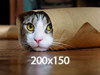
The flag object is a design pattern similar to the media object, however it utilises `display: table[-cell];` to give us control over the vertical alignments of the text and image.

  • .pr-[1|2|3|...]: alter the spacing between the image- and text-content.
  • .flex-row-reverse: reverse the horizontal rendered order of the image- and text-content.
  • .items-[start|end]: vertically align the image- and body-content differently. Defaults to middle.

Text-like content goes here.

1
2
3
4
5
6
<div class="flex items-center">
  <img class="pr-6" />
  <div>
    ...
  </div>
</div>

Layout

Don't forget <!-- --> between the layout items.

Available sizes

Foo
Bar
1
2
3
4
<div class="flex flex-wrap">
  <div class="pl-6 w-1/2">Foo</div><!--
  --><div class="pl-6 w-1/2">Bar</div>
</div>

Lists

Bare list

  • Item 1
  • Item 2
1
2
3
4
<ul>
  <li>Item 1</li>
  <li>Item 2</li>
</ul>

Inline list

The List-inline object simply displays a list as one horizontal row.

  • Item 1
  • Item 2
1
2
3
4
<ul>
  <li class="inline-block">Item 1</li>
  <li class="inline-block">Item 2</li>
</ul>

Media Object

The Media object module is inuitcss’ implementation of Nicole Sullivan’s media object—the poster child of OOCSS.

  • .pr-[1|2|3|...]: alter the spacing between the image- and text-content.
  • .flex-row-reverse: reverse the horizontal rendered order of the image- and text-content.

Text-like content goes here.

1
2
3
4
5
6
<div class="flex">
  <img class="pr-6" />
  <div>
    ...
  </div>
</div>

Pack

1
2
3
4
5
6
7
8
9
10
11
12
13
14
15
16
1
2
3
4
5
6
7
8
9
10
11
<div class="flex">
  <div class="flex flex-1">
    1
  </div>
  <div class="flex flex-1">
    2
  </div>
  <div class="flex flex-1">
    ...
  </div>
</div>

Ratio

Create ratio-bound content blocks, to keep media (e.g. images, videos) in their correct aspect ratios.

  • .before:pb-[calc((1/2)*100%)][null9/28|9/21|1:2|3/4|9/16|2/3]: create rectangle with chosen ratio, defaults to 1:1 square.
Content inside a 2:1 rectangle
1
2
3
4
5
<div class="ratio before:pb-[calc((1/2)*100%)]">
  <div class="ratio-content">
    Content inside a 2:1 rectangle
  </div>
</div>

Tables

  • .table-fixed: forces all cells within a table to occupy the same width as each other
  • .table-[xs|sm]: less to more padding inside table cells
Key Value
14 Calvados
50 Manche
61 Orne
1
2
3
4
5
6
7
8
9
10
11
12
13
14
15
16
17
18
19
20
21
22
<table class="w-full table-xs">
  <thead>
    <tr>
      <th>Key</th>
      <th>Value</th>
    </tr>
  </thead>
  <tbody>
    <tr>
      <td>14</td>
      <td>Calvados</td>
    </tr>
    <tr>
      <td>50</td>
      <td>Manche</td>
    </tr>
    <tr>
      <td>61</td>
      <td>Orne</td>
    </tr>
  </tbody>
</table>

Wrappers

Page-level constraining and wrapping elements.

  • .container-[narrow|wide] : control max width.
default
narrow
default
wide
1
2
3
4
5
6
7
8
9
10
11
12
<div class="container">
    default
  </div>
  <div class="container container-narrow">
    small
  </div>
  <div class="container">
    default
  </div>
  <div class="container container-wide">
    wide
  </div>

Alignment

  • .text-[left|center|right]: align content at the desired position.
  • .breakpoint:text-[left|center|right]: align content at the desired position, starting at breakpoint.

Available breakpoints

Left-aligned content
Centered content
Centered content, only after desk breakpoint
Right-aligned content
1
2
3
4
5
6
7
8
9
10
11
12
<div class="text-left">
  Left-aligned content
</div>
<div class="text-center">
  Centered content
</div>
<div class="lg:text-center">
  Centered content, only after <em>desk</em> breakpoint
</div>
<div class="text-right">
  Right-aligned content
</div>

Border Radius

Round all corners of an element.

  • .rounded: add a round corner, with a globally defined radius.
Content
1
2
3
<div class="rounded">
  Content
</div>

Box Shadow

Drop a shadow below an element.

  • .shadow-[null|sm|lg]: drop a shadow.
Small shadow
Regular shadow
Large shadow
1
2
3
4
5
6
<div class="shadow">
  Regular shadow
</div>
<div class="shadow-lg">
  Large shadow
</div>

Coloring

  • .text-primary: primary color.
  • .text-grey-[lightest|lighter|light|dark|darker|darkest]: gray color and variants.
  • .text-white: pure white.
  • .bg-primary: primary background color
  • .bg-[grey-light|pink|violet|orange|green]: background color variants

Primary color

Gray color, Gray color light, Gray color dark.


1
2
3
4
5
6
<span class="text-primary">Primary color</span>,
<span class="text-grey">Gray color</span>,
<span class="text-grey-light">Gray color light</span>,
<span class="text-grey-darkest">Gray color dark</span>.
<div class="bg-primary">
<div class="bg-grey-light">

Spacing

Margin and padding helper classes.

  • .m/p-(margin|padding)(empty|top|right|bottom|left)(empty|1|2|3|...): margin or padding, applied to all|top|right|bottom|left side, with size variant default 1|2|3|...
Content
1
2
3
<div class="ml-6 mb-3 p-12">
  Content
</div>

Positioning

  • .fixed: fixed position.
  • .breakpoint:fixed: relative position, then fixed position starting at breakpoint.
  • .absolute: absolute position.
  • .breakpoint:absolute: relative position, then absolute position starting at breakpoint.

Available breakpoints

Visibility

  • .sr-only: hide only visually, but have it available for screen readers.
  • .hidden: don't display.

Widths

  • .w-(1-8)/(1-8): fractional width of the element.
  • .w-x/y@breakpoint: full width, then width applied at breakpoint.

Available breakpoints

lg:.w-1/2
lg:.w-1/2
.w-1/3
.w-1/3
.w-1/3
1
2
3
4
5
6
7
8
9
10
<div class="flex flex-wrap">
  <div class="pl-6 w-full  lg:w-1/2">...</div><!--
  --><div class="pl-6 w-full  lg:w-1/2">...</div>
</div>

<div class="flex flex-wrap">
  <div class="pl-6 w-1/3">...</div><!--
  --><div class="pl-6 w-1/3">...</div><!--
  --><div class="pl-6 w-1/3">...</div>
</div>